Creating the Perfect Book Cover
- By: Jessica Faust | Date: Sep 14 2016
Authors and agents spend a lot of time nitpicking over covers. Should the type be a tiny bit bigger? Is that tree branch too heavy? Does the quote need to be moved? Is the color wrong?
They say you don’t judge a book by its cover, but we all know you really do. When it comes to the little things though, how much of a difference does it really make? If you aren’t standing by two of them, side-by-side, does the more expensive version really look better or does the overall concept still sell the book? Or does the tone of the book completely change simply by adjusting an image by three inches or removing the cover model’s chest hair or changing the font?
Recently we had such a debate over cover art for Elizabeth Kane Buzzelli’s re-release of Dead Floating Lovers.

Above is the first cover we considered. While we all liked it we thought it looked a little top heavy.

So the artist modified the cover with this version. Definitely brighter, but is it better? And since they are so similar, would one really sell more books than another?
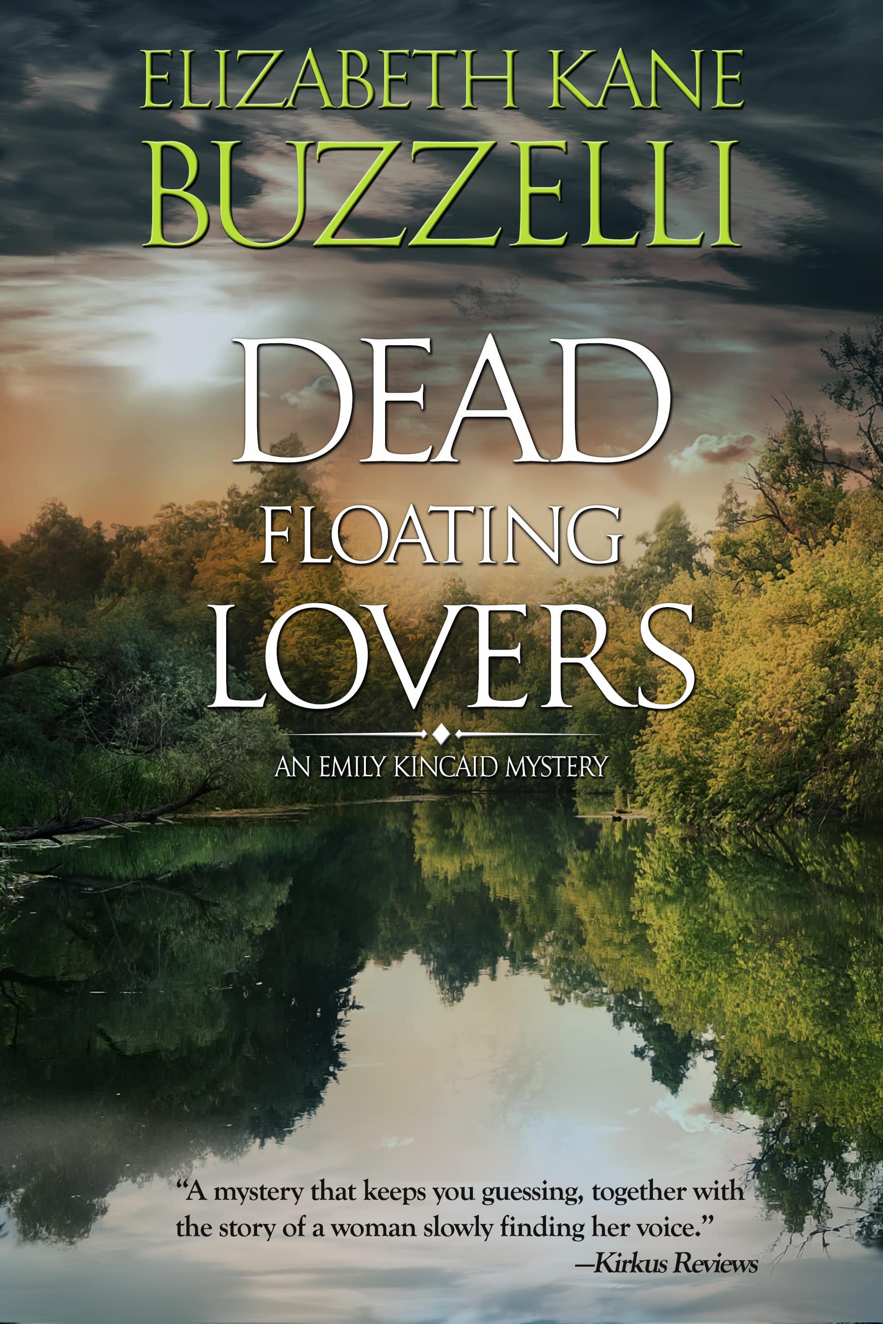
Everyone agreed the second cover wouldn’t work. It felt too much like women’s fiction to us, but the branch in the first cover still bugged us. So we got a third cover. No branch, and definitely an ominous feel, but still as striking as the first two covers we saw.
The cover we finalized is one we are all very happy with, but it’s a debate agents and authors have nearly daily and, like nearly everything else in publishing, how we view the cover and its potential impact on final sales of the book, is subjective.
I like the third cover for a mystery. I didn’t like the tree in the first one, and the third one does have a more ominous feel than the second.
Although (not knowing anything about the story) I did look for something floating in the water. Not a body necessarily, but an empty canoe, or a paddle, or a hat or…
My writing friends and I often discuss covers, and it’s interesting what some like and others don’t. Definitely comes down to personal taste.
As someone with absolutely no talent for picture design I shouldn’t really be talking, but still. I can understand perfectly the second cover didn’t appeal to you guys. The feel should be ominous, and in this cover the clear sky, the “happy sunset” just won’t do. I liked the thick branch in the first cover, though. While it is is heavy indeed, it goes well with the word “Dead” and it made me instantly think of two lovers having been killed with a club. The other two are just too peaceful for to me. I would’ve gone for the first cover, but then again, I’m by no means an authority in the field.
It’s amazing what a slight shift of an image can do to the overall impression. What a pleasure it must be to work with a team on such a key element of a book’s presentation! I spend what seems, at the time, to be a disproportionate amount of time on graphics for social media or to accompany a post. This reminds me it is time well spent.